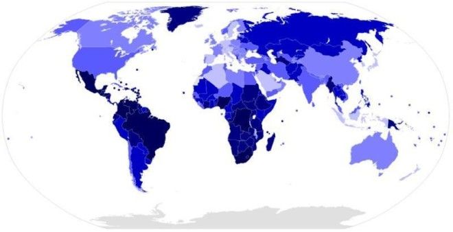
No matter how you look at the numbers, the picture doesn’t get any better. According to the United Nations Office on Drugs and Crime’s Global Study on Homicide 2013 (which is the most recent report), intentional homicide rates across Europe are widely below one homicide per 100,000 inhabitants. The same goes for China, Japan, and the rest of far east Asia. The United States, often reviled for its supposedly high murder rate, sits at 3.8. The world average? 6.2.
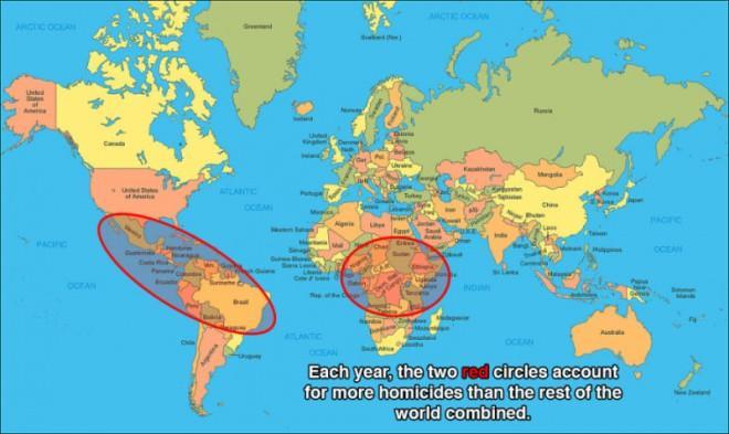
As for some of the most violent countries in Latin America and central Africa? 38 (Lesotho), 53.6 (Venezuela), and 84.3 (Honduras, with the highest murder rate in the world). So why are these numbers so high?
The explanations that have surely already jumped to mind are the drug trade (for the former) and rebel militia/terrorist groups (for the latter). And while those horrendous problems are indeed largely responsible, there is, underneath all that, something else at work.

The map above compares the world’s national homicide rates (using data from the 2013 UN study); the darker the color, the higher the homicide rate. As you’d guess, Latin America and sub-Saharan Africa are covered in darkness. But that map’s trends in homicide rates — not just in Latin America and Africa, but the world over — snap into focus when you pair it with another map:

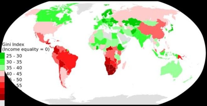
The above map used World Bank data to determine the income inequality level (expressed by what’s called a Gini coefficient) of most countries around the world. The higher the country’s score, the greater its income inequality (with dark green being the most equal and dark red being the least equal, on the map).
Advertising
With a few notable exceptions (China, the horn of Africa), income inequality level and homicide rate line up strikingly well (compare the two preceding maps and you’ll find dark blue and red in the same areas, and light blue and green in the same areas):

Indeed, as study after study and report after report have found — from the pioneering Harvard research on the subject in the late 1990s until now — the biggest factor in national homicide rate is the level ofincome inequality.
Tellingly, among countries with World Bank-certified high-income economies or among the countries in the Organisation for Economic Co-operation and Development (OECD membership is often used as the standard that signifies a “developed nation”), the United States’ income inequality level is shockingly high.
And that very likely helps explain why, compared to other developed nations with homicide rates well below one per 100,000, the the United States’ 3.8 per 100,000 homicide rate is likewise shockingly high.

