There’s no denying that there’s a science behind advertising, but a successful campaign also includes a level of artistry. It’s one thing to be able to grab people’s attention, however, a great advertisement knows how to keep it.
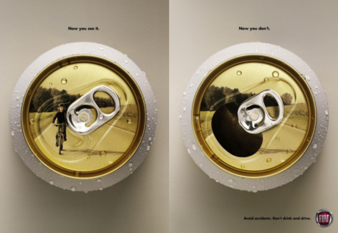
1. Despite laws against it, the act of drinking and driving continues to be enough of an issue that both alcohol and car companies have attempted to steer their customers away from intoxicated driving through their advertisements. Automobile manufacturer, FIAT, created one powerful campaign that effectively shows how drinking can impair your ability to drive and how it can put other lives in danger. The series of posters, produced in Brazil, show potential drunk driving victims on the lids, which disappear once the tab has been opened.
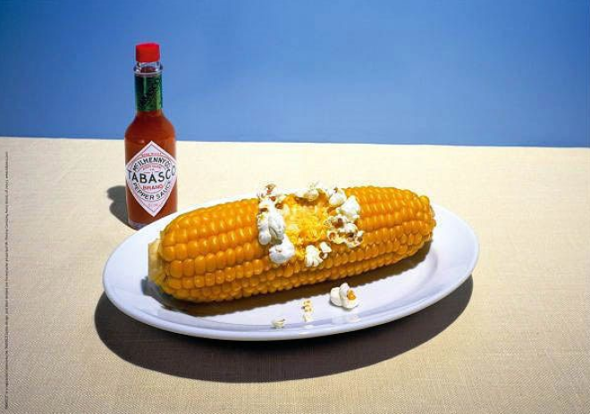
2. Many hot sauce brands have come up with innovative ways to show potential customers that their product truly brings the heat, but few do it as cleverly and as subtly as this Tabasco advertisement. Corn on the cob turning into popcorn with the addition of some Tabasco? Now that’s some hot sauce.
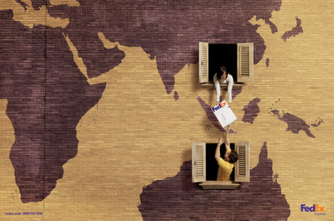
3. DDB Brazil created an incredibly simple but effective campaign for the multinational courier delivery service company, FedEx. The advertisements show packages being passed from one window to the next while the continental maps give the transaction a context. The posters show not only the multinational service being offered but how quick and easy it can be.
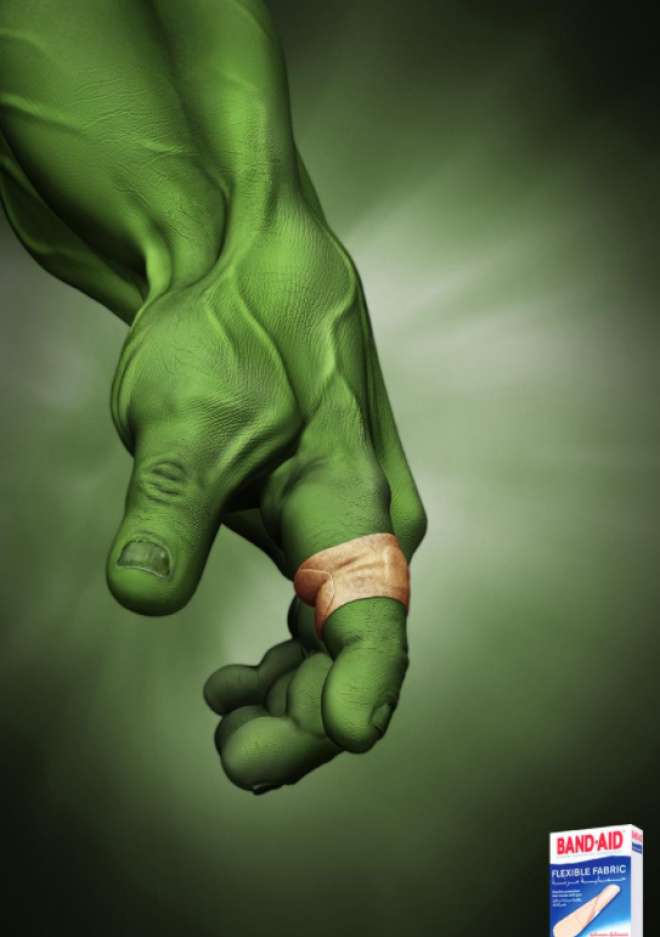
4. What better way to show the flexibility of a wearable product than to use everyone’s favorite rage-induced Marvel superhero, The Hulk. His shirt may not be able to endure his gargantuan transformation, but clearly, these Band-Aids can. The advertisement was created by J. Walter Thompson, the United Arab Emirates campaign for Band-Aids’ new flexible fabric.
5. Many brands will cater their advertising to adhere to whatever holiday is around the corner, but New Year’s Eve is a trickier celebration to accommodate. However, Italian advertising agency, Y&R, found a clever way to use Barilla’s pasta to resemble the multiple fireworks commonly used to ring in the new year.

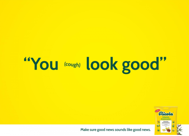
6. An effective advertising campaign isn’t always about striking images, sometimes simple copy can do the job. These bright print advertisements by Germany’s Miami Ad School show how a variety of well-intended sentences can become hindered by an unexpected cough. This clever concept was created for the cough drops manufacturer, Ricola.
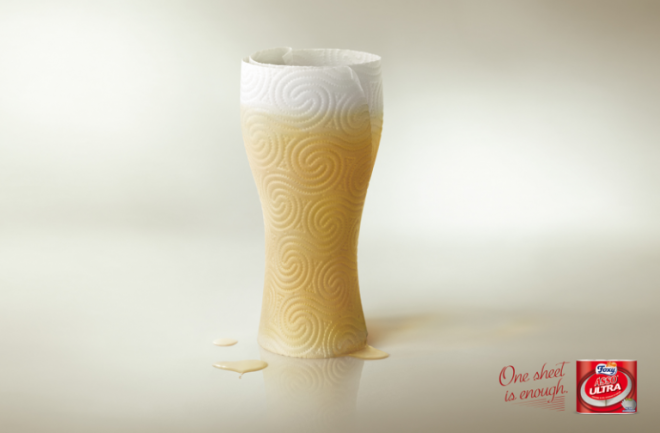
7. When advertising a cleaning product like kitchen towels, you want to convey that your product can get the job done better than the competition, which Italian advertisers Ferdinando Galletti and Davide Pasquale did masterfully in this campaign for FOXY Asso Ultra. The product’s ability may be exaggerated, but the imagery brilliantly complements the “One sheet is enough” slogan.
8. Australian agency, Arnold Furnace, found a clever way to promote Jack Daniel’s new honey-flavored whiskey. At first glance, it looks like the bottle is being swarmed by bees, which makes sense for the flavor. However, this advertisement goes a step further by creating this illusion using a horde of people with the fitting tagline, “Draws a crowd.”

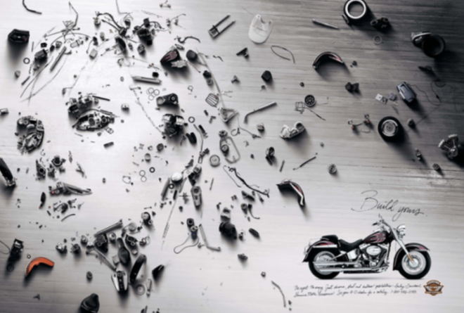
9. Brock Davis and Eric Sorensen’s brilliantly executed concept for this Harley Davidson Parts and Accessories advertisement shows every part of a motorcycle with the dismantled pieces arranged to represent each unique rider. This campaign, which promotes the ability to customize the vehicle, was recognized at the Cannes Lion International Festival of Creativity.
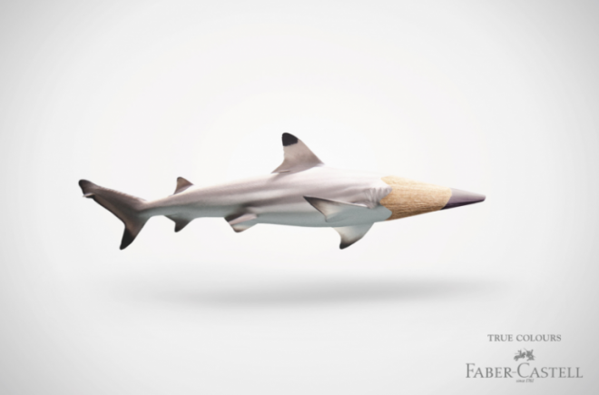
10. German advertising agency, Serviceplan, found an incredibly clever way to illustrate Faber Castell’s line of “True Colours” pencils. To appeal to artists, these advertisements matched their array of colored pencils with real-life animals and objects. The combined imagery of a pencil tip with a similarly colored thing shows how specific their range of colors is.
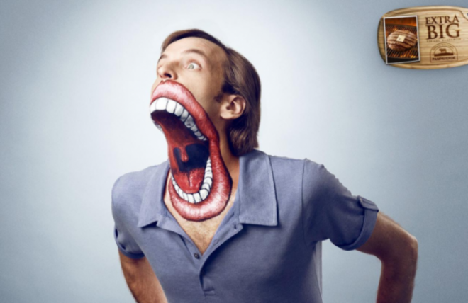
11. It’s not often you see an advertisement for food where the actual product is so small scale, but this fairly unsettling image undeniably will grab people’s attention and pique their curiosities to know more. Chile advertising agency, La Mesa, created this big-mouthed campaign to promote Pampavarde’s extra big burger.
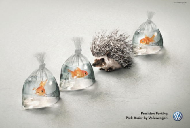
12. DDB Tribal Berlin created this striking advertisement to increase Volkswagen’s sales of optional features on their new cars. This particular ad highlights the park assist feature by showing a hedgehog in the middle of some very vulnerable bagged fish. It’s an image that conveys impending disaster until you read the slogan.
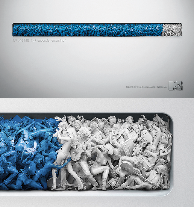
13. This simple yet incredibly detailed advertisement was created for MTV’s anti-piracy campaign. The image shows a typical online download bar, but if you look closer, you’ll notice that it’s made up of music fans illegally downloading content, which in the result is harming the actual musicians. The message is further conveyed by the tagline, “Switch off illegal downloads. Switch on MTV.”
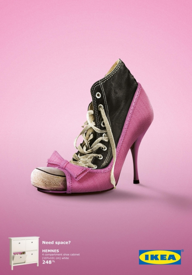
14. Anyone lacking storage space is familiar with the need to commingle items to put them away. Advertising agency, Tbwa/Istanbul, took advantage of this problem by showing two familiar shoes that have been forced together to save space. The attention-grabbing image is followed by the space-saving solution of an IKEA cabinet.
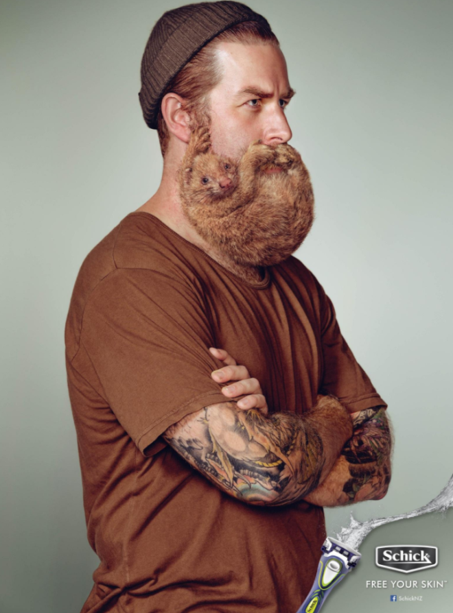
15. Anyone who has ever grown a beard knows that extensive facial hair can require an annoying amount of maintenance. New Zealand advertising agency, Y&R, found a way to relay this concept by placing furry creatures in the place of beards to promote Schick’s “Free Your Skin” line of razors.
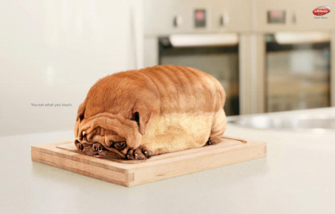
16. Pets are a surefire way to attract the attention of animal lovers in an advertisement. Showing pets that look like food? Now that warrants an explanation. Advertising agency Lowe gave a great one. To promote Lifebuoy Hand Wash, this campaign adorned the bizarre imagery with a simple line that explains it all, “You eat what you touch.”
17. In a generation where technology has drastically changed how we communicate with one another, getting people to resort back to mailing letters is a tough sell. However, Australia Post created an eye-catching image that shows how meaningful a handwritten letter can be. Personifying the letter in this advertisement brilliantly helps convey the message on display.

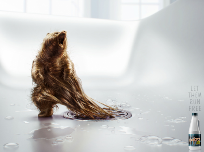
18. Fahrenheit DDB Peru won 2 Bronze Lions for their “Let Them Run Free” campaign. The series of advertisements show hair from the drain taking the form of animals that can be freed back into the wilderness with the product Dukto Drain Opener. No one wants to look at a hair-clogged drain, but this advertisement found a way to add a visually appealing angle.
19. Ogilvy Malaysia’s LEGO advertisements truly went above and beyond for their campaign. Each outdoor advertisement was created to resemble a LEGO version of the location it was placed. Not only do these advertisements work with the potential customer’s familiarity, it also shows how the toy can create unlimited designs.
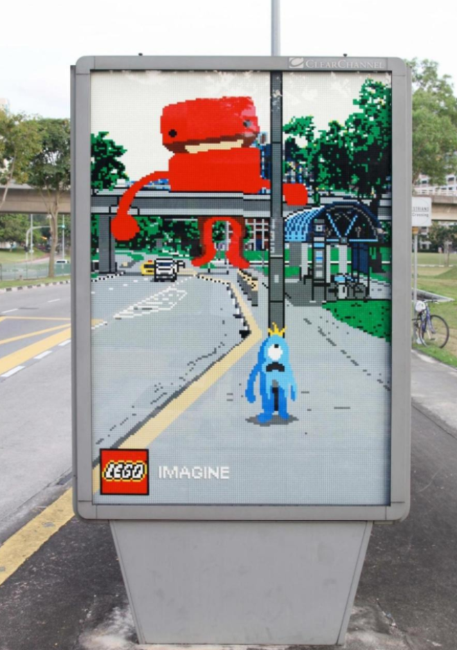
20. What’s better than grabbing people’s attention with a familiar fictional character? Grabbing their attention with two! Alexandre Tissier created a series of LEGO character mashups to promote the idea that the toy has no limits when it comes to the user’s imagination. The series of ads were created for LEGO’s “Fiction meets fiction” campaign.

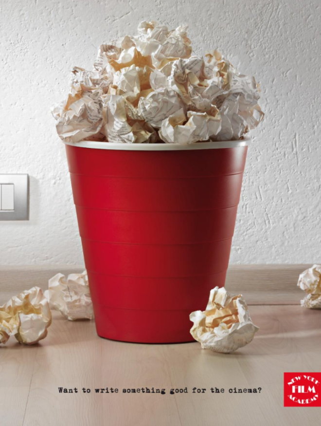
21. New York Film Academy turned to an advertising agency, Red Cell Milan, to help promote their screenwriting program to potential students. The metaphoric imagery shows something any creative writer can relate to: multiple trashed drafts. The overflowing trash can was cleverly designed to make it look like a bag of movie theater popcorn.
22. Advertising agency, Ogilvy, came up with a fresh take on how to highlight a cleaning product’s superior absorbency. Showing the area of the spill as a drain isn’t only a striking and unique visual, it also makes the observer instantly associate the product with having the liquid-removing power of a drain.

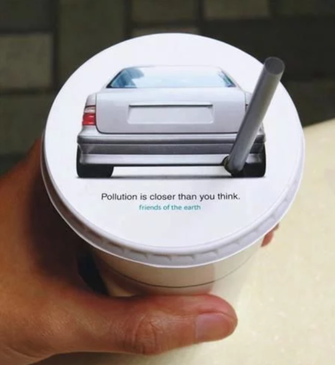
23. A car’s exhaust pipe is the last place you’d want to put your mouth, which is why Hong Kong advertising agency JWT created this visual to get their point across. This “Pollution is closer than you think” campaign for Friends of the Earth makes the straw resemble a car exhaust pipe to get the user thinking about how pollution can directly affect them.
24. There’s definitely no shortage of creativity in the ad campaign for the College for Creative Studies. The advertisement comically takes a stab at the “fried egg” drug PSAs that were popular in the 80s. The advertising firm, Team Detroit, created the satirical campaign, which was quick to go viral on the Internet.

