Match Group owns Tinder, PlentyOfFish, Match, HowAboutWe, and OkCupid. And according to its IPO prospectus, it generated revenues of $888.3 million last year, up about 11% year-over-year.
The dating app space is heating up — JSwipe, a popular dating app aimed at Jewish people, was recently acquired by its competitor, JDate.
But what are these dating apps really like to use?
As Business Insider's resident 23-year-old, I was obliged to poke around and try out some of the most popular dating apps. For this story, I compared OkCupid, Tinder, JSwipe, Hinge, and Bumble — and I was surprised by the app that ultimately became my favorite.
First up: Tinder, which seems to be the preferred dating and hookup app of all my friends. Tinder is probably Match Group's most prolific portfolio company, and is known for pioneering the "swipe right" feature that has since been adopted by nearly every other major dating app.
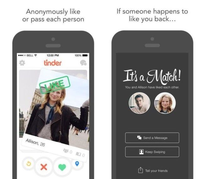
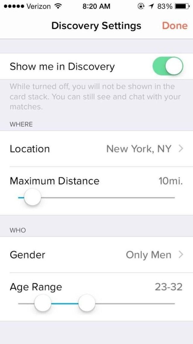
The first thing you'll want to do on the app is set up your preferences and your profile. You can opt not to be shown in Discovery — the stack of profiles people swipe through — but what's the point of that? You can also choose how far away the people you match with can be, your location, the gender of people you'd prefer to see, and the age range you're interested in.
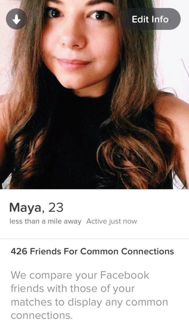
Your profile is a bunch of pictures of yourself. You can also opt to add a 500-word bio.
Once you're all set up, you're ready to swipe. You can tap the heart button if you're interested in a person's profile, or the X button if you're not. Conversely, you can also swipe right, of course, to express interest, and left to pass.
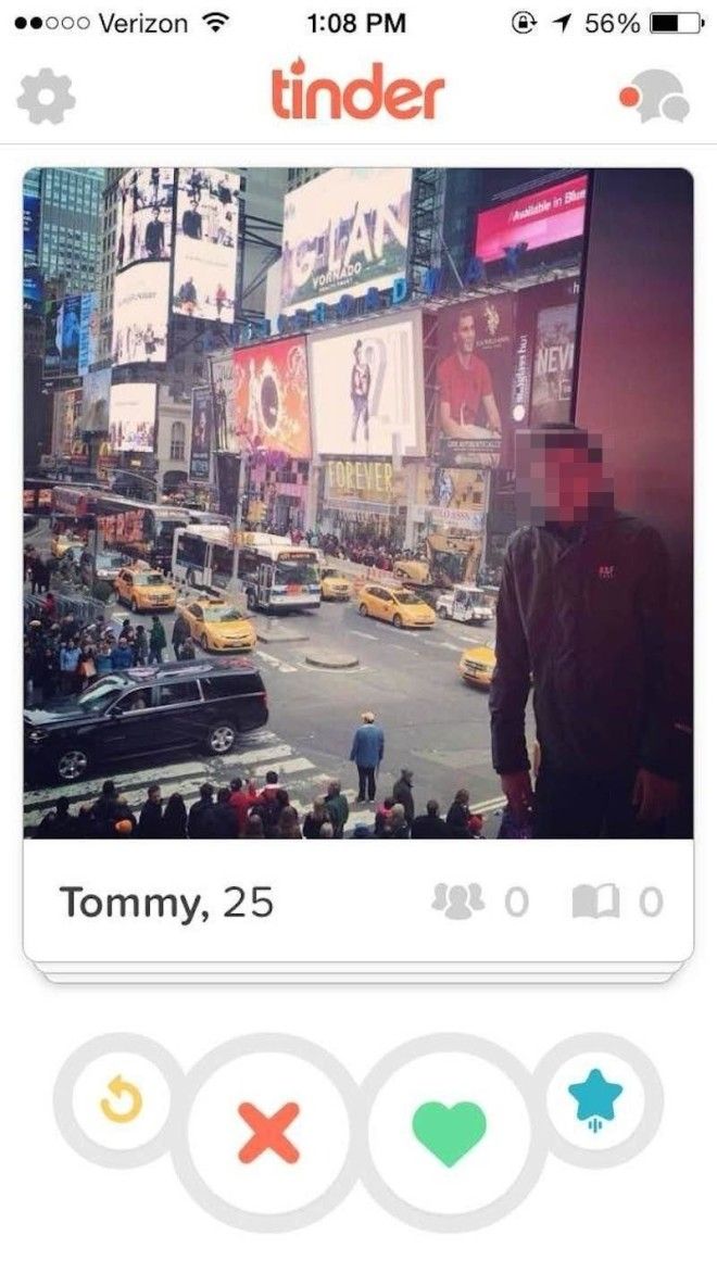
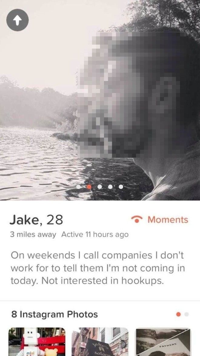
Tap on a person's picture to see more about them. You'll be shown mutual Facebook friends (if applicable), mutual interests (also pulled from Facebook), the user's Instagram pictures (if they've linked their Instagram with their Tinder profile), how far away they are from you, and the rest of their pictures, if they've uploaded more than one.
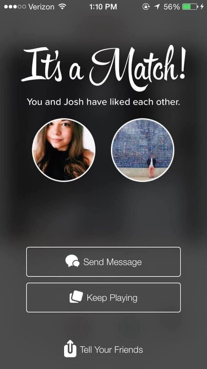
If you and another user both right-swipe each other, congrats! You'll be matched with them. You can elect to send them a message or keep swiping.
This is how a lot of conversations on Tinder start (for me, at least) ...

... other opening messages could use a little finessing.

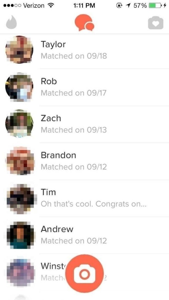
The biggest problem with Tinder is that it's so easy to swipe through people's profiles, everyone seems to forget about their matches — and nobody wants to be the first person to send a message.
For those too shy to initiate a conversation right away, Tinder's "Moments" feature lets you see photos that your matches have uploaded, and swipe right or left on them. So, for example, if you wanted to talk to Michael but maybe didn't want to have to send the first message, you could swipe right on his Moment, below. Moments last for 24 hours and then self-destruct, like a Snapchat Story.

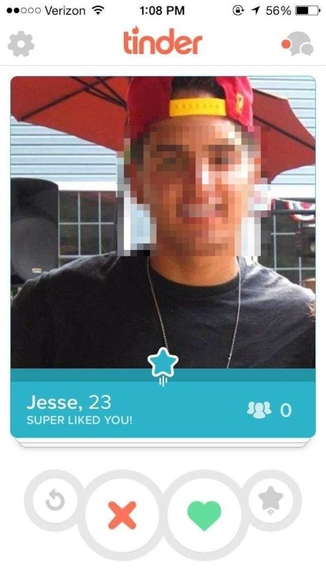
Tinder also recently rolled out a "super likes" feature. A "super like" indicates that you *really* like another user, and your profile gets shot to the top of their stack of potential matches, so they can see that you've super-liked them. You get just one super-like a day, and they don't carry over. After that, if you want more, you will need to pay for Tinder Premium.
OK, enough about Tinder — there are plenty of other dating apps out there. Hinge is a competing dating app that prides itself on matching you with friends-of-friends (unlike Tinder, where who you're matched with is based on your preferences and your location), so we decided to give it a whirl.
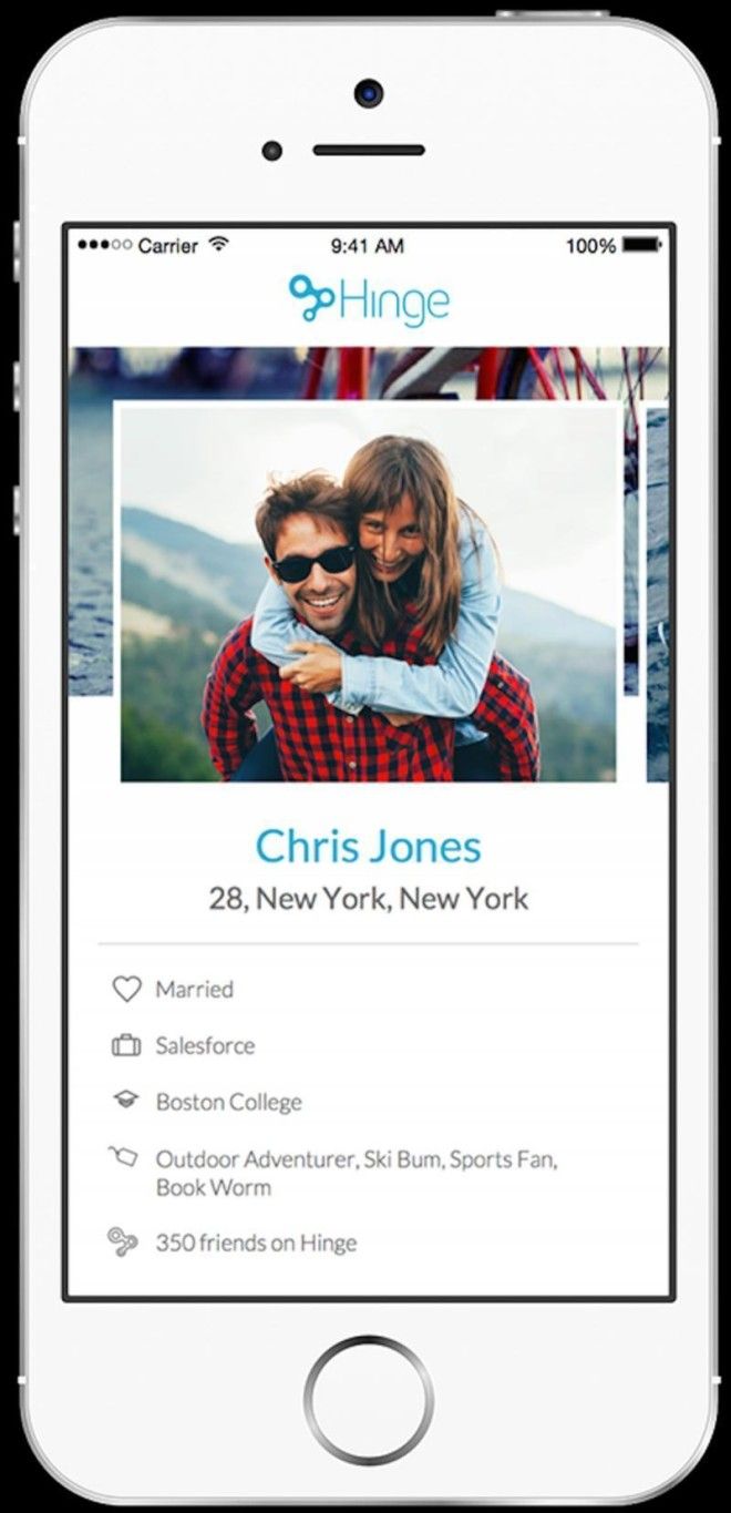
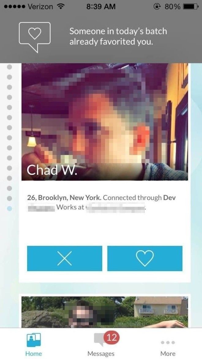
Hinge shows you a set number of users every day — it's not unlimited swipes like Tinder, but you're given, in theory, a more curated list of eligible bachelors or bachelorettes — they're all people your friends already know. Like Tinder, you can swipe right or left, or tap the heart or X buttons.
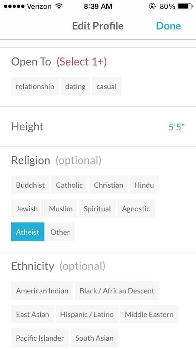
Where Tinder is most notably a hookup app, Hinge is pretty clearly meant for people who want something more thorough than a one-night stand. In addition to all the normal discovery preferences you have with tinder — the gender of the people you're interested in, age, location, etc. — you can input things like your height (an extremely important factor on dating apps, for whatever reason); what you're looking for; your religion; and your ethnicity.
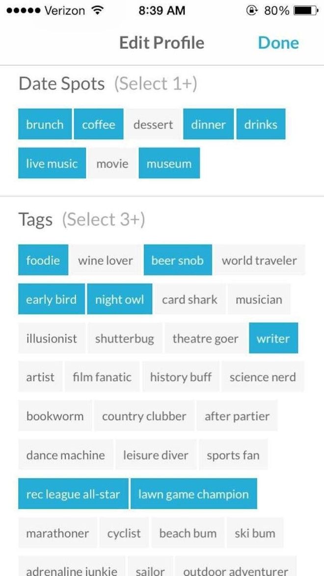
You can also add things to your profile like your preferred dating spots, and some phrases from a Hinge-created list that best describe you. It's kind of goofy, but it's fun, and my impression is that people don't take it too seriously.
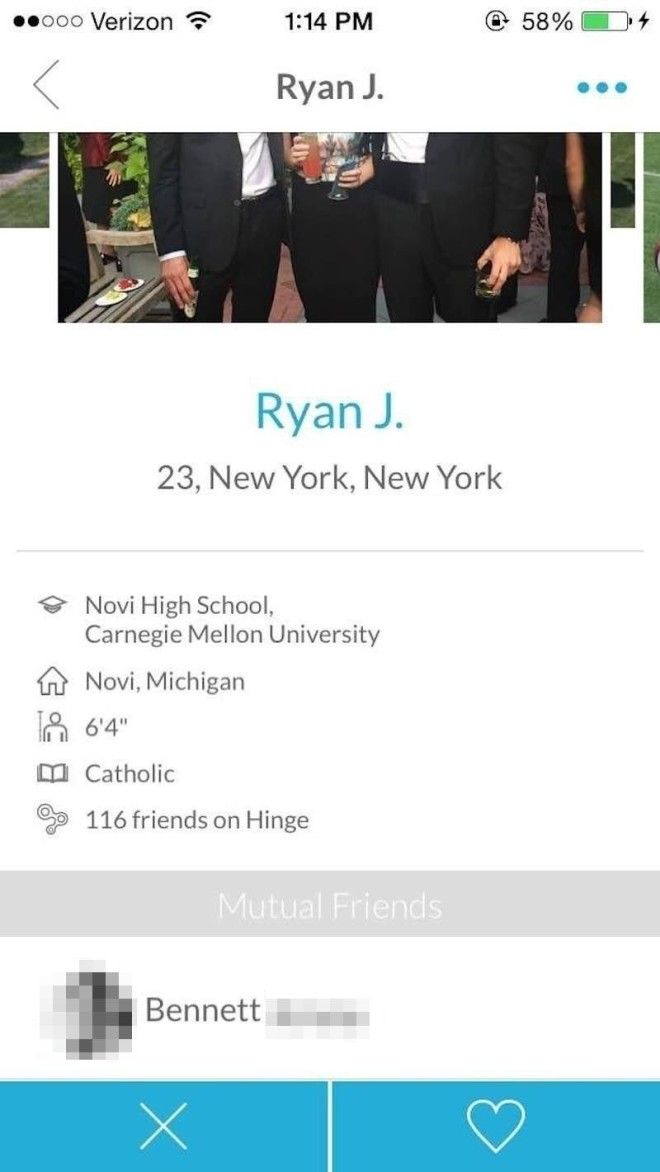
Click on a user's profile to see more information about them. You'll also be shown the mutual friends you have in common.
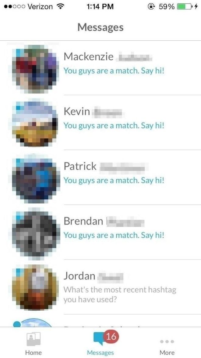
Once you match with someone, you can see their first and last name (Like Tinder, Hinge pulls data from Facebook, which is how it knows your full name, information like where you went to school and where you work, and your mutual friends).
OK, that was fun. But what if you're looking for a faith-based dating app? Look no further than JSwipe, the dating app aimed at Jewish people, which was recently acquired by competitor JDate.
Not Jewish? Don't worry, me neither. You can still select the "Willing to Convert" option when you're filling out your profile.
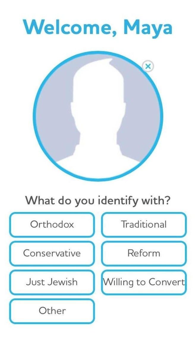
Like other dating apps, you add photos of yourself, as well as a bio, if you so choose.

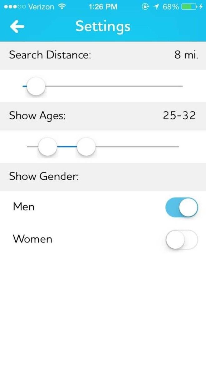
And, like Hinge and Tinder, you can choose some basic preferences. (By this point in my dating-app comparison, I was feeling a bit weary of repeatedly filling out these profiles).
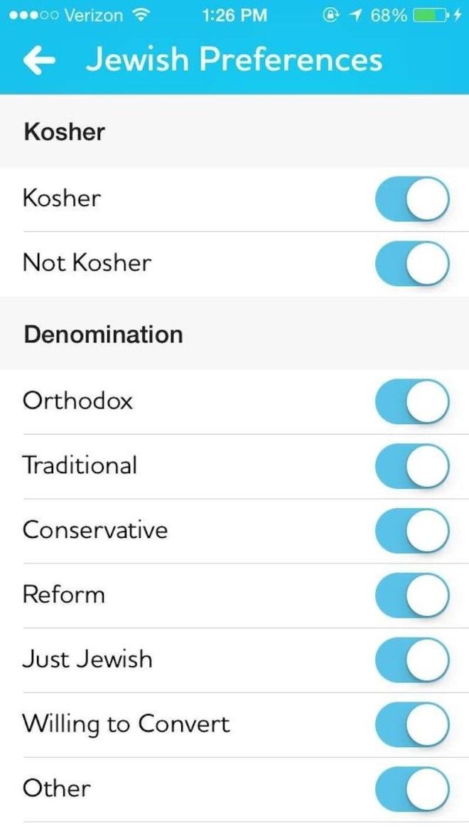
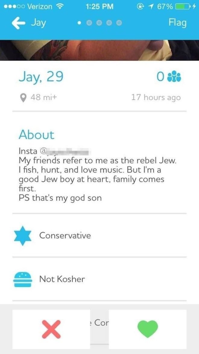
Of course, you can also choose some Jewish-specific preferences, such as whether you prefer to date someone who keeps Kosher, or if you'd prefer to pair up with someone of a preferred Jewish denomination. As a non-Jewish person, I figured I couldn't be too picky.
Like Hinge and Tinder, you can swipe through users' profiles. Unlike Hinge or Tinder, if you misfire and accidentally swipe left on someone you meant to swipe right on, you can click the button on the bottom-left corner to retrieve their profile. On Tinder, you have to pay for this privilege.
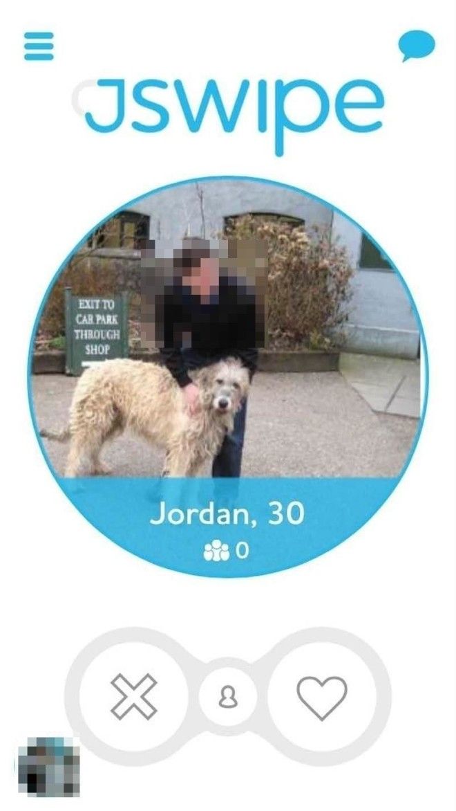
Here's what, in my experience, a typical JSwipe profile looks like. (I kept mine blank, because "Atheist tech reporter" doesn't really have a nice ring to it on a religious dating app).
Advertising
The best part of JSwipe is when you match with someone. Staying on brand, JSwipe shows you this festive "Mazel Tov!" screen.

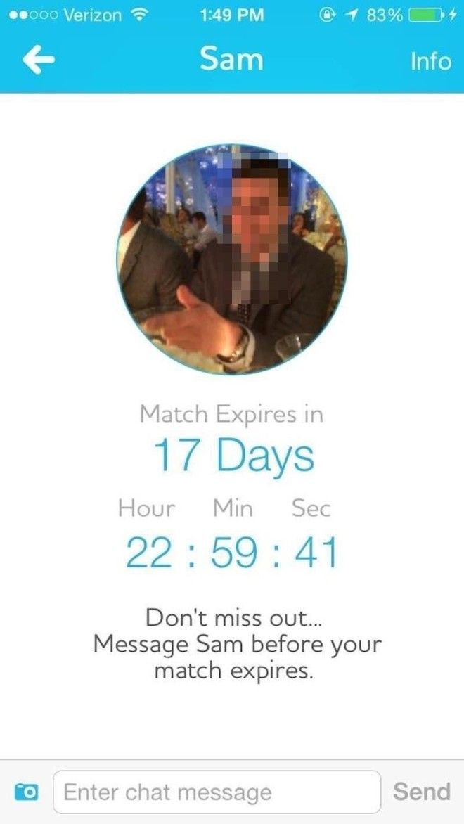
Unlike Hinge and Tinder, your matches on JSwipe expire. This isn't actually a bad idea, as it forces both parties to make conversation.
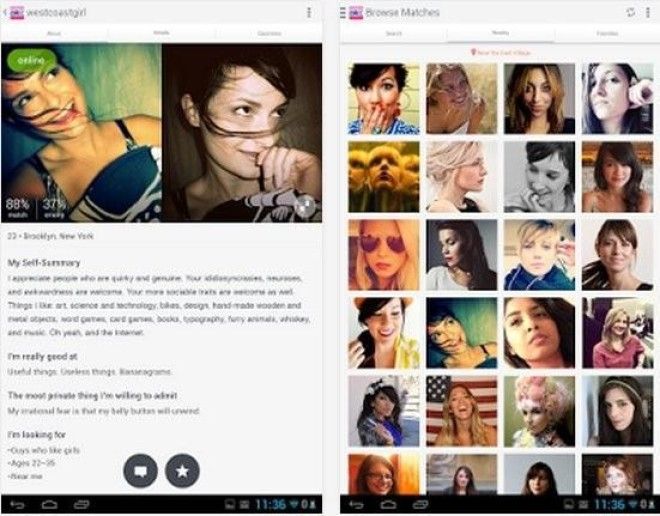
By far my least favorite of the five dating apps I visited was OkCupid, which I actually deleted 12 hours into my review of it. Another Match Group property, I found OkCupid's user interface too clunky and the people who chose to message me to be completely random — at best, I was inundated with replies, and at worst, they were gross, inappropriate messages from people I had little in common with.
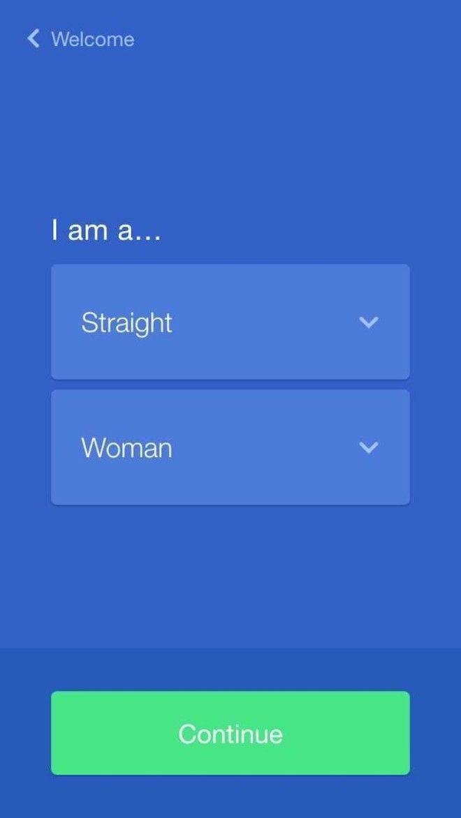
Again, you start off by telling the app some basic information about you. You can import a lot of it from Facebook.
OkCupid, as far as I can tell, relies on an algorithm to match you up with people. It bases this off of your answers to questions like "Are you a cat or dog person?" as well as how you'd hope someone else would respond to the same question. You can also rank these questions by importance. I found this to be needlessly thorough and exhausting.
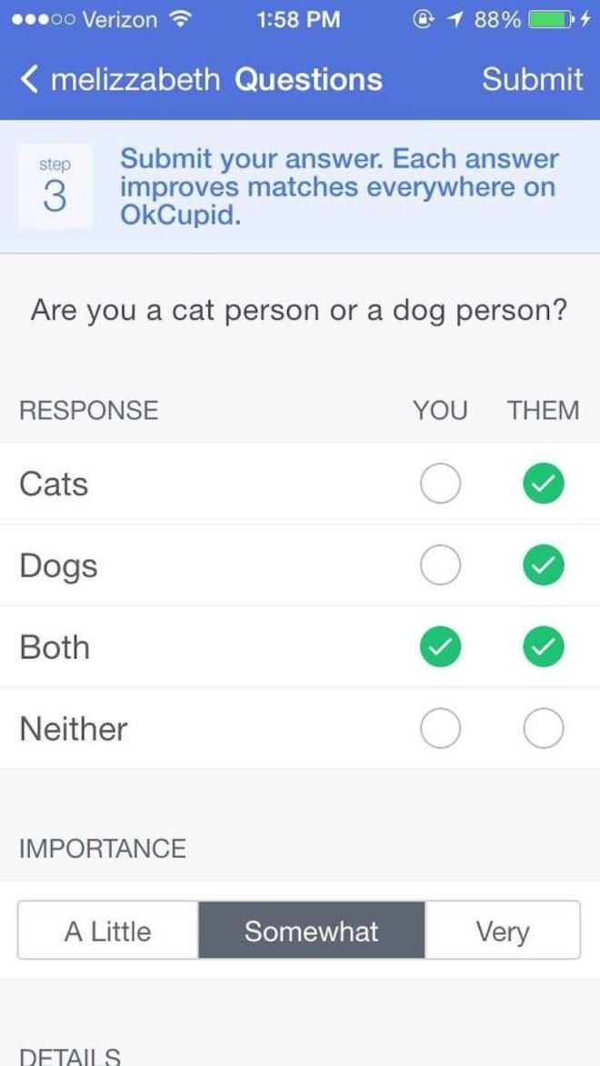
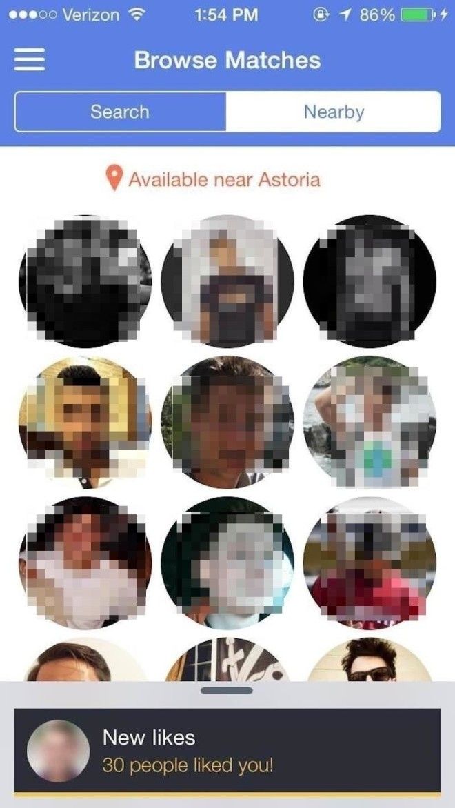
You can browse people on the app who live nearby you, or you can do a search. OkCupid also has a Tinder-like swiping option for viewing people's profiles. I found OkCupid's user interface to be too busy, with too much going on. Every screen had a pop-up telling me how many new people had viewed my profile, liked me, or sent me a message. It was really overwhelming.
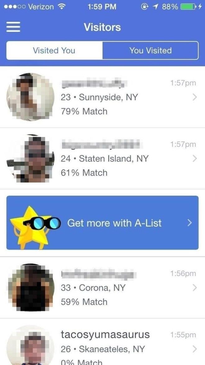
Here, you can see the users who have visited your profile, and what your match percentage is with them. Presumably, the higher the percentage, the more you have in common, and the more likely you are to hit it off.
I got a lot of messages like this, and a lot more I couldn't publish because they're too gross. The best part of Tinder and Hinge is that you have to voluntarily match with someone before they can message you, so you're vetting the people who will eventually talk to you; on OkCupid I felt like a piece of meat, and anyone could send me a message. I deleted the app 12 hours after downloading it.

At this point, I was feeling dating-app fatigue. But I had one more app I wanted to try: Bumble. Heralded as a so-called feminist dating app, Bumble makes girls make the first move on guys. It was founded by Whitney Wolfe, the ousted Tinder cofounder.

I'll admit: I was really skeptical of Bumble at first. I wasn't crazy about having to start every conversation I had with a guy, especially after several days of trying a bunch of dating apps. But almost instantly Bumble became my favorite of the bunch.
Again, you set up your profile. Bumble's user interface is pretty basic, maybe most comparable to Tinder. You see the person's age, where they work (you can also opt to put a more general occupation title if you don't want your specific employer out there for all of Bumble to see), where you went to school, and a brief bio.
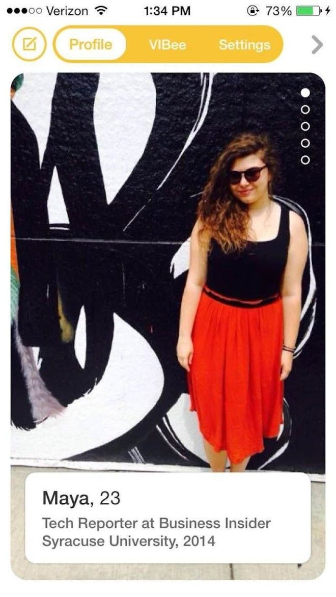
Swipe right if you're interested, and swipe left if you're not.

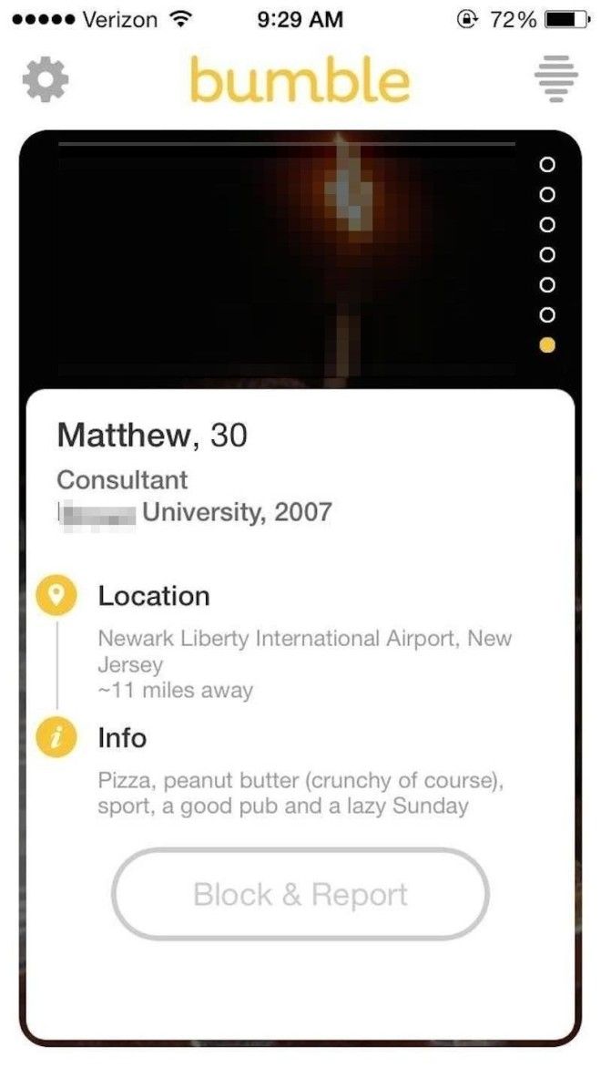
Here's what a full profile looks like.
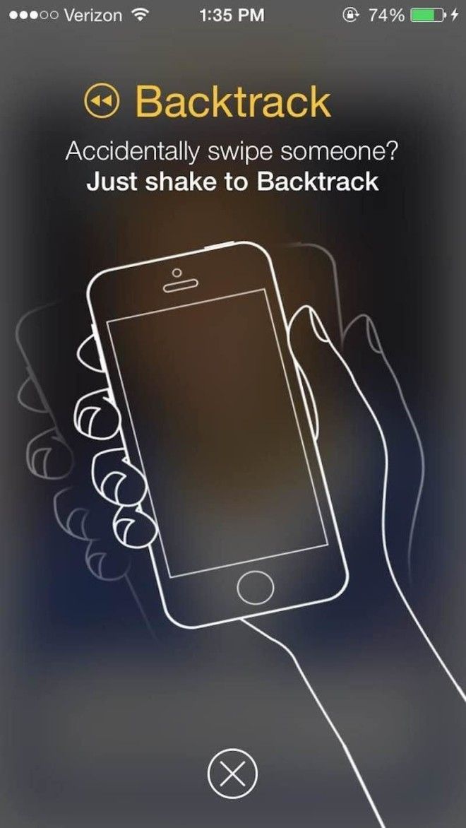
If you mess up and accidentally swipe the wrong way on someone, you can undo it by shaking your phone. (I tried this to make sure it works.) Again, it's a pretty useful feature, considering apps like Tinder make you pay or upgrade your account to be able to undo a mis-swipe. And I personally can't justify spending money on a dating app.
BOOM. Here's what it looks like when you get matched up with someone.
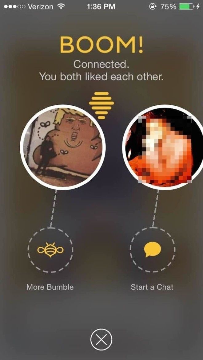
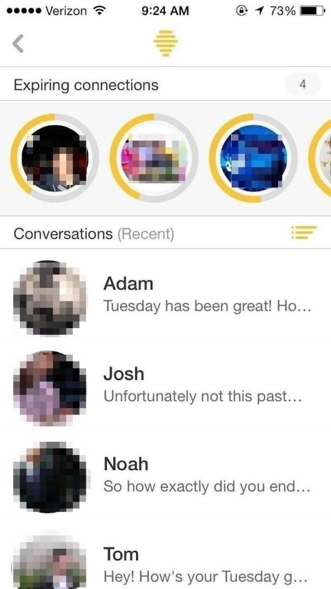
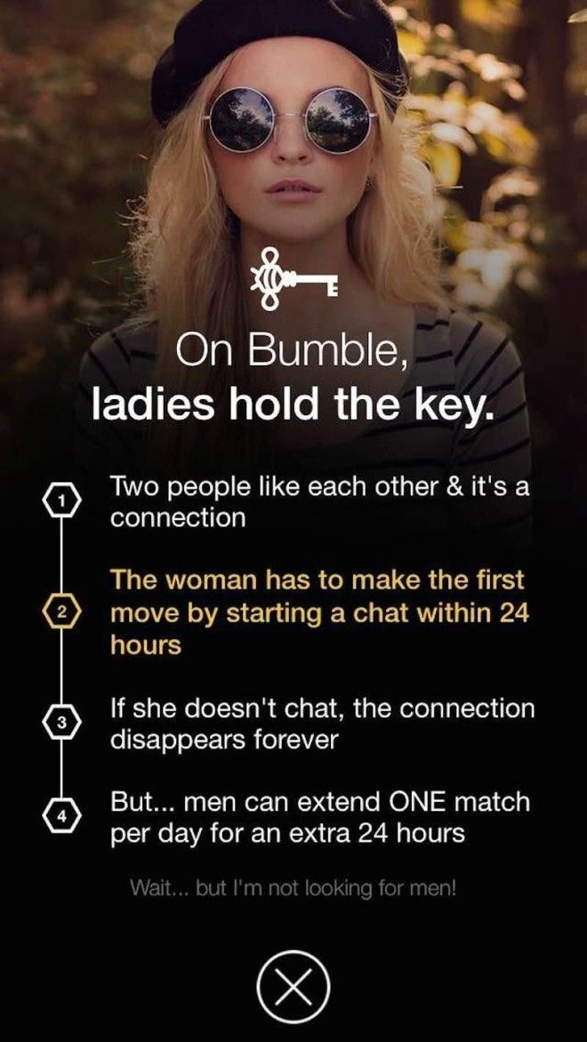
Your connections expire within 24 hours, so you're prompted to say hi if you want the conversation to go anywhere — and the burden is on the women to start the conversation, (Same-sex couples who use Bumble do not have the same rules for who can message first.) Typically I abhor having to start a conversation on a dating app, but I quickly realized things couldn't go anywhere if I didn't say hello. So I did! And I actually had some pretty good conversations.
