Kinda like your profile picture on Facebook that you always update and change to the best photo that you got. Companies spend a lot of time and money on planning and putting up the best logo for their company. Some didn't change a lot, but these sure did.
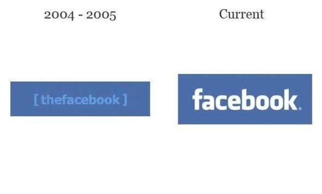
So Facebook is originally named [thefacebook]. Yes, enclosed in brackets.
Shell
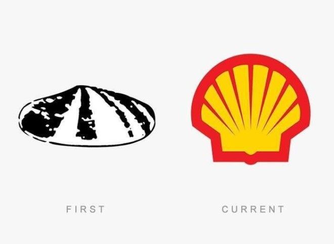
Shell was too literal back then.
McDonald's
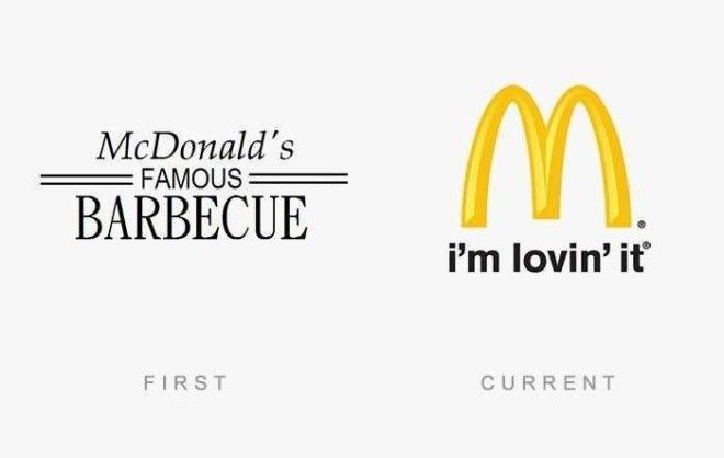
I guess McDonald's started as a barbecue place.
Mozilla Firefox
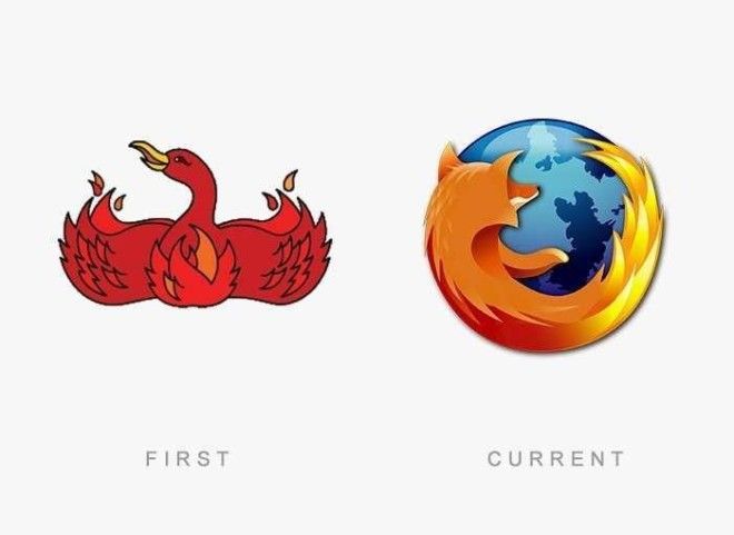
So... it wasn't a firefox before?
Canon
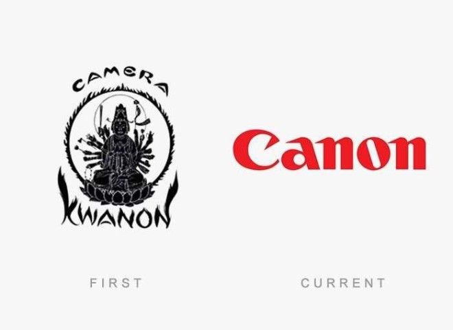
Kwanon. Right.
Apple
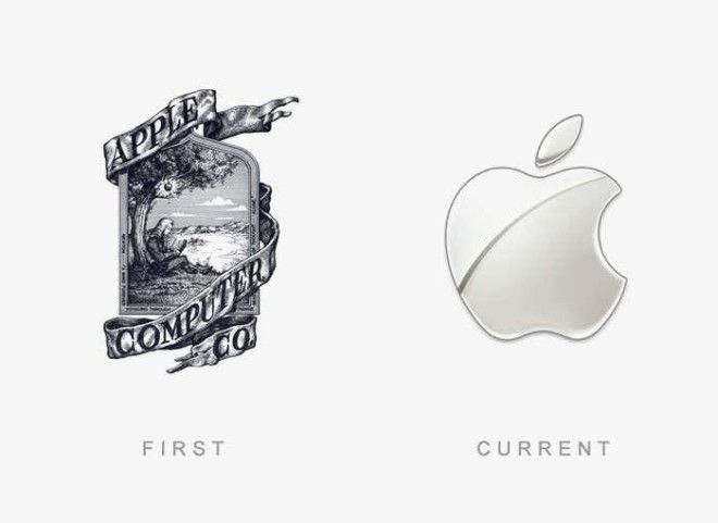
Apple went totally minimalist.
Procter & Gamble
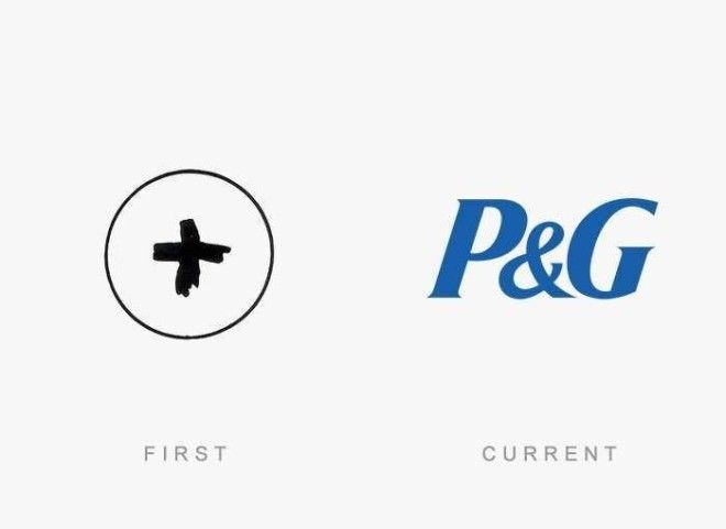
This is really interesting. P&G actually went a lot of changes in terms of logo design. This is the very first one, followed by the half moon and star design which gathered a lot of controversy.
Nestle
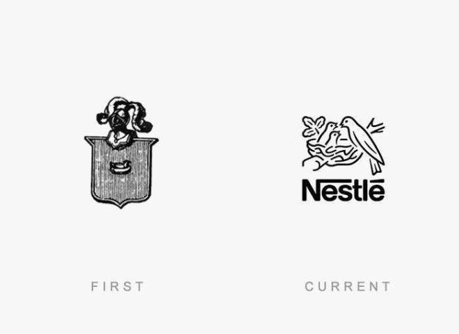
Advertising
The first logo is based on the owner's family coat of arms. It evolved to the known birds nesting logo.
Burger King
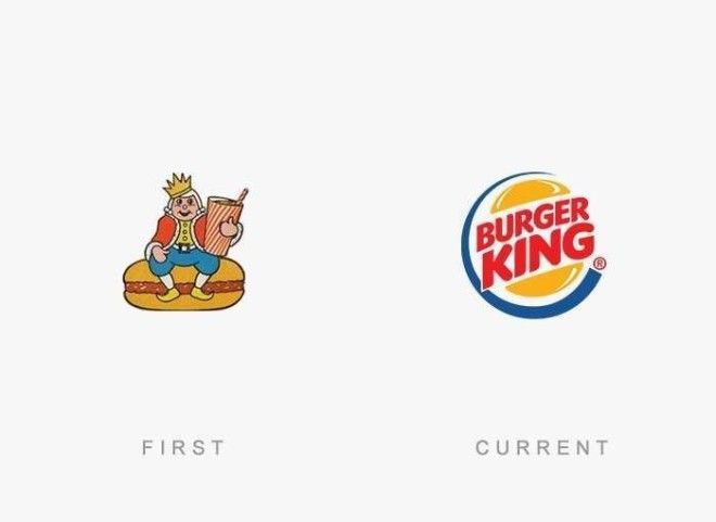
Oh, that's why it's called Burger King.
Playboy
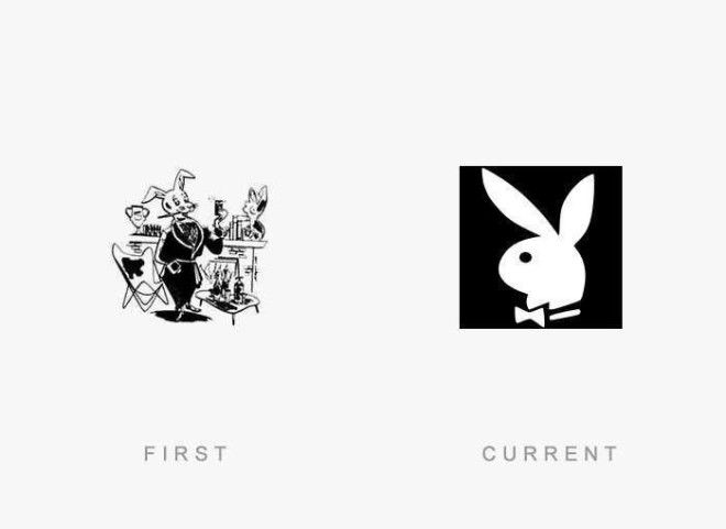
The first "Playboy" is indeed v. naughty.
Coca-Cola
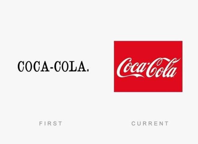
That's plain and simple, coke.
Pepsi
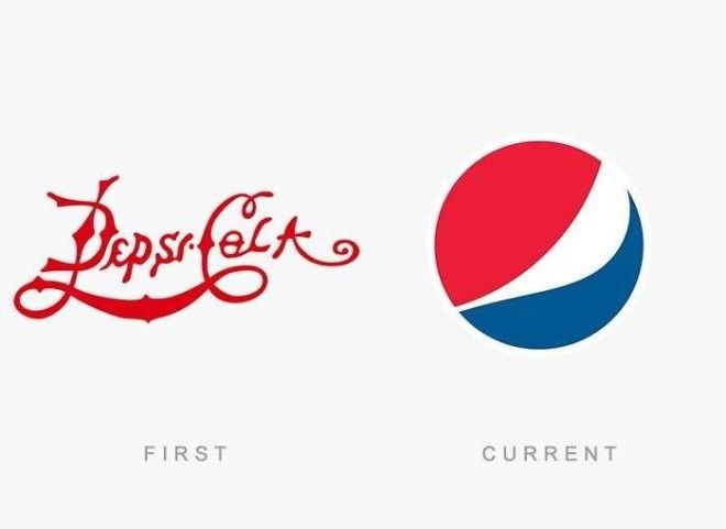
The first Pepsi logo looks a bit like the new coke logo.
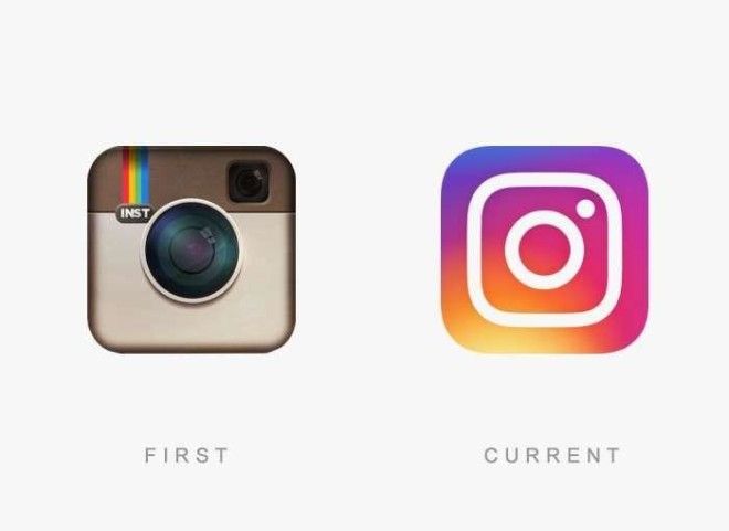
Now this one made it to the news. Some loved it, some did not.
Adidas
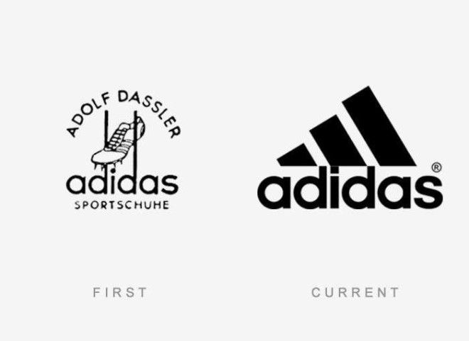
That first logo is really descriptive.
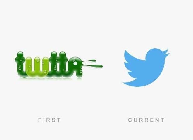
So, Twitter was initially slime.
Nokia
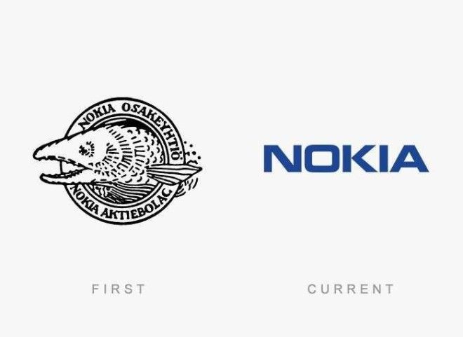
Nokia had a fish on its logo. Interesting.
Starbucks
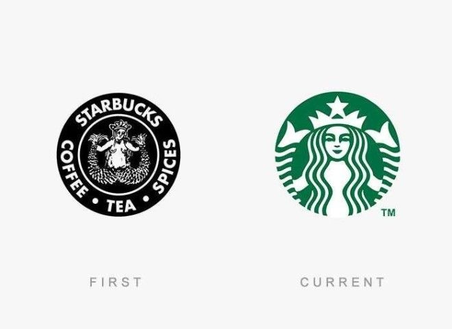
The Starbucks lady is more conservative now than before.
